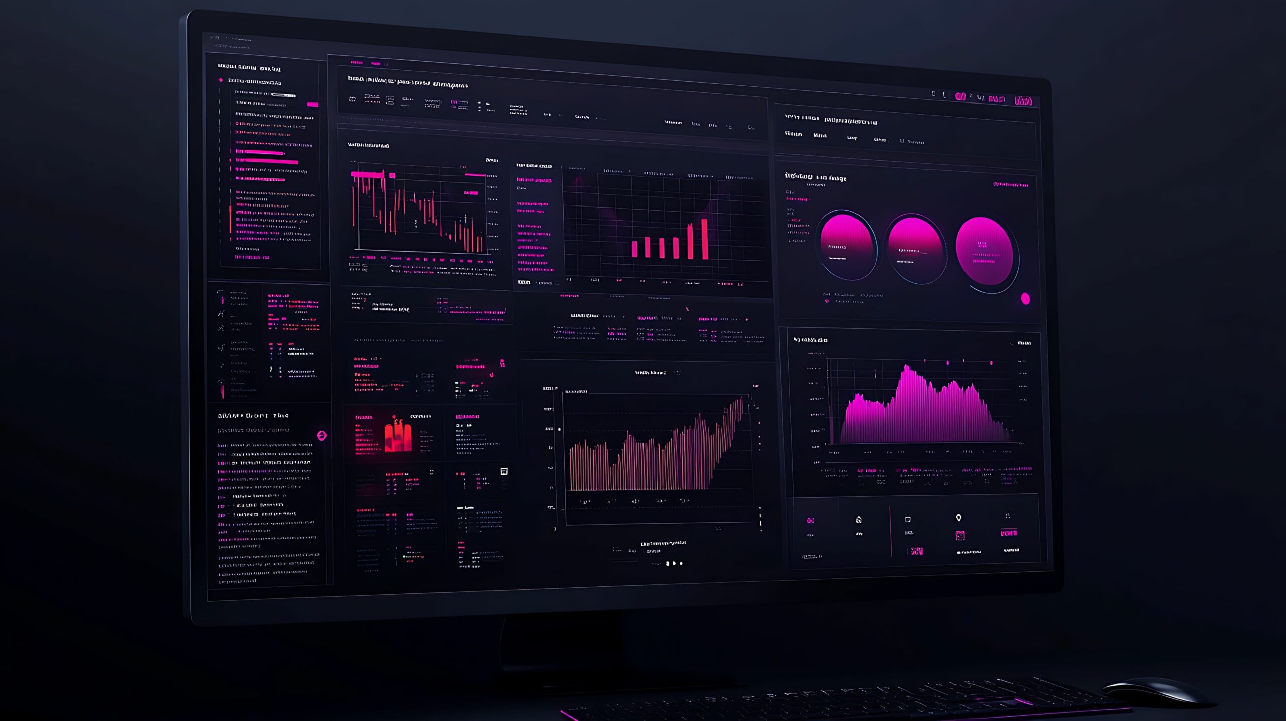
Embracing Dark Mode in Web and Mobile Design
If the history of IT over the past half a century has taught us anything, it’s that when Apple makes a big call on UX and design, you can guarantee the rest of the computing world will follow.
So when dark mode was rolled out as a feature of MacOS Mojave in 2018, quickly followed by iOS 13 a year later, the writing was on the wall. Sure enough, Google had read the mood music and made dark mode a feature of Android 10 almost immediately after iOS 13 was released.
A quirky feature that had previously been available in the accessibility and display settings of a small minority of websites and apps was now a system-level option on billions of devices.
You can guess the rest of the story. The use of dark mode has exploded in the past five years. A survey of MacOS Mojave users found that 82.7% started using dark mode, and a similar figure has been touted for the number of Android users who prefer it.
This has significant implications for web designers, who now face having to optimise the appearance and functionality of sites in two contrasting colour schemes. But as we’ll argue in this blog, it’s well worth the effort, and not just because it fits with currently trendy user behaviour.
As well as having aesthetic benefits, which we’ll cover, dark mode can radically improve the on-screen user experience, make your site more accessible for people with visual impairment, and also help reduce carbon emissions by lowering how much energy devices need to consume.
Back to Basics: What is ‘Dark Mode’?
Dark mode flips the standard light-dark on-screen colour scheme. Instead of the white/light background with darker elements on top that we’re all familiar with on any kind of computer screen, dark mode has a dark/black background with lighter elements on top.
If you’ve yet to experience dark mode, the best example of what it looks like is Microsoft’s command prompt – black screen, commands typed out in white text. This itself is a throwback to the very earliest days of computing, when nearly all interfaces were command line/script execution interfaces – and were also monochrome white-on-black due to the limitations of cathode ray tube screens.
The first ‘light’ interface was introduced by Xerox in 1973. As well as changes in screen and GUI technology, one theory about why ‘light mode’ came to dominate the next 50 years is that the first mass-market computer programmes were word processors. Developers wanted to replicate the experience of using a typewriter with black ink on white paper.
While the ink-on-paper aesthetic has apparently suited generations of ordinary computer users, it’s perhaps revealing that software developers don’t necessarily agree. Some 92% of developers prefer dark mode for writing their code, a strong endorsement of the original command line colour scheme from people who spend their working lives in front of a screen.

Benefits of Dark Mode
Looking at a back-lit white screen means you are working your eyes hard by, in effect, shining a light into them. Doing this for hours on end, day in and day out, puts your eyes under considerable strain, leading to fatigue, difficulty concentrating, and long-term damage that, in all probability, will eventually lead to you needing glasses.
This is what all those software developer types are latching onto with their preference for dark mode. 90% of people who use dark mode report it eases the strain on their eyes. This, in turn, translates into a 17% reduction in symptoms such as dry eye and headaches and a 21% reduction in macular degeneration.
Dark mode also has specific UX benefits in specific situations. 85% of users believe dark mode reduces glare when devices are used outside in bright sunlight. And 82.7% of people who use dark mode do so when using devices late at night, based on the fact that screens in dark mode emit less blue light, the part of the spectrum that ruins sleep by tricking the brain into thinking it’s night time.
Accessibility
Some people are more sensitive to issues like light-inflicted eye strain and screen glare than others. Some people struggle to read anything on a backlit screen full stop. So, having dark mode as an option doesn’t just help web users make informed decisions about their own eye health. It’s a more inclusive option for hundreds of thousands of people who live with a whole range of visual impairments and struggle with light screens.
Sustainability
The evidence points to dark mode being a healthier option for the planet, as well as people’s eyes and sleep patterns.
One university study found that, compared to screens run at 100% brightness in light mode, switching a device with an OLED screen to dark mode can slash energy consumption by 67%. That’s because, to make a screen white (or even coloured), power has to be sent to every individual pixel. To make it black, you switch the pixels off.
This can improve battery life by up to 44.7%, reducing the need to plug phones in so often and cutting back on energy consumption.
Aesthetics
Finally, for all the virtues of the benefits outlined above, web designers might still be reluctant to really lean into dark mode if it was aesthetically unappealing – or, even worse, compromised other aspects of the user experience in favour of alleviating eye strain and glare.
But in fact, one of the reasons dark mode has taken off so successfully is because it does have an attractive aesthetic quality of its own. We often associate ‘eye-catching’ with bright, bold colours. But dark mode demands a more subtle, understated approach which is at once tasteful, modern and very much in keeping with the principles of minimalist web design.
Dark Mode Design Considerations
So, from a design perspective, how do you optimise for dark mode when building a website?
The primary design consideration for any website, whatever the colour scheme, is usability. And that incorporates readability, too. The text has to be legible, and the distinction between elements on the page needs to be maintained. That comes down to maintaining an effective contrast.
The good news is that light-on-dark, and especially black-on-white, does create an effective and user-friendly contrast for text especially. As we’ve discussed above, it’s easy on the eye, and that naturally helps us to scan dark-mode pages easily.
However, it’s important to remember that most web users are accustomed to light mode, and the switch to dark does take some adjustment. Designers can help with this by sticking to the principles of user-focused, minimalist design. Plain font types, appropriate text sizes and careful use of spacing to help maintain clarity within text and between elements can all make it easier for new users to adjust.
There’s no doubt that white-on-black monochrome colour schemes can be used to create highly striking and effective aesthetics. But for all its benefits for readability and usability, it’s a very limiting colour palette to restrict yourself to. Colour is part and parcel of modern website design. People expect visual interest, especially in the form of images, as much as they expect easy-to-read, easy-to-navigate pages.
Choice of colour palette is therefore an important consideration with dark mode. When you start with a dark canvas, you want brighter colours for the elements you place on top to create the level of contrast required. But too much colour can look cluttered and overwhelming in dark mode. Designers tend to find that working with a smaller palette works best, using colour sparingly. A little goes a long way against a dark background.
If you’re looking to create a dark mode option for your WordPress site, you will need a plug-in. Get in touch with our WordPress website designer team to find out more about the latest dark mode options.


